We had many positive feedback from the poster. many said their suited the genre in many ways.
One person said that "i love the fact that you made the 'police tape', as a finishing line, hopefully others will understand it, but in my opinion that is the best object in the poster". Another person stated that he didn't really understand the concept of the poster, but after we explained it to him, about the finishing line and the block in the background, he thought it was fabulous however he thought we should make the protagonist bigger. In addition, we took time to show another b-tec media class in our school. we thought we should show them as they are experienced in poster and the design of it. they all stated that it was very good. however 2 people said that there is too much writing. one person in the class stated that the background suited the genre, and they even said "it was soo good, there is even a little twist in the poster, the police line!!
Finally, we showed our media teacher, Mr. Hull, and asked him for his personal opinion about the poster. He was stunned after he saw the poster! He said that "He's has never seen any of his students make any better poster!". After he said that, Our group was very confident terms of the poster.

Showing posts with label Poster Production. Show all posts
Showing posts with label Poster Production. Show all posts
Tuesday, 1 May 2012

Sunday, 29 April 2012
Final Poster

The poster took the group most of the time to do. however, i believe that all the time used was very effective with a result of a 'magnificent' poster as our teacher said. The poster was different to the one created in last years media work, as we were more open minded. In addition, the background was injected, meaning our protagonist wasn't really in that block, but with the groups skills on using the software's needed, we made it as if the protagonist was in the background which gives a better feel to the audience.
Thursday, 23 February 2012
Poster Original Images
Here are some photos we originally took and then chose the best one in order to create a very good poster. We had from many to choose, but our group sat down and looked through all of them and chose the most photo suitable to be included in the poster.


Tuesday, 21 February 2012
Poster Construction
Here are some screen captures we took from our Mac Book Pro to show that our group done it and we didn't copy any one else. It also shows the amount of work we had to put it in each stage:

 We had many different ideas in which how out poster wanted to be like, here are our to main options in which we had to take into further action which one to choose. We asked around the school to our main target audience and they chose the top one. They said it suited more and the police tape also gave that better feeling to the poster, making the audience feel that he is doing something wrong, in which they later find out during the film that they are totally not.


Thursday, 29 September 2011
Feedback on Poster
After we created our poster, we thought of asking different people about the poster and how it could be improved. We even created a chart which shows how many people like it, dont like it and poeple that think the poster could be improved.

Judging by the results that are on the pie chart, it was clearly shown that the majority of our participants said they liked the film. However out of 20 participants, 3 thought it wasn't good enough which in my opinion, is good as 85% of our participants thought otherwise. only 5 thought that it could slightly be improved however we asked them it detail how, and they gave us some tips in which our group will later have a discussion if we should have some changes.
Judging by the results that are on the pie chart, it was clearly shown that the majority of our participants said they liked the film. However out of 20 participants, 3 thought it wasn't good enough which in my opinion, is good as 85% of our participants thought otherwise. only 5 thought that it could slightly be improved however we asked them it detail how, and they gave us some tips in which our group will later have a discussion if we should have some changes.
Draft Poster
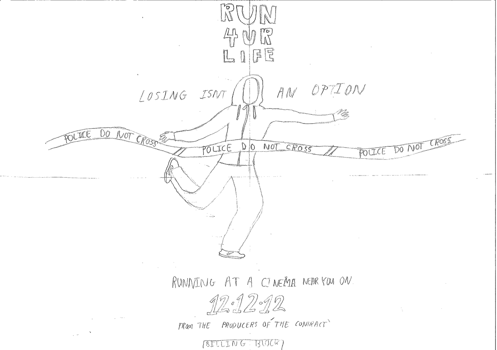
This is our draft poster. Similar to 'I AM LEGEND' it centers our protagonist and our film name (which is in a bold easily read font). We chose to isolate our protagonist in the poster to show how youth feel today ;abandoned and alone. We also used to the tape to create a sinister atmosphere although this is in fact a finishing line for our runner and portrays breaking through the stereotypes or barriers he is faced with (reinforced by his race finishing posture). At the top colloquial language such as 'U' and '4' is used to engage with the audience and more importantly to empathise with them ; through second person address.It is also a form of imperative , somewhat harsh which we hope will be more absorbed by young people because a majority have grown in aggressive environments and this is more easily understood. The title not only reflects our film's content but also appeals to youth to grab the opportunities in life and to not give up.
One thing we forgot to include in this poster was color which would have more clearly made visible the police tape and sirens which should be reflecting from his face.
In addition, the poster keeps the twist of the film hidden to the audience as it doesn't portray anything about Olympic runners. The protagonist is symmetrically centred so the audience can familiarise with who he is. In the poster the character is also postured as if he has finished a race but instead of having to cross the ribbon and flashing camera lights which await most runners he is faced with a police 'do not cross' tape and a blue light reflected from police sirens is on his face.We used the police do not cross tape in order to symbolise the stereotypes our character is breaking through and the race (struggle) youth have to face today in order to fulfill their dreams.
We have also used many conventions of a film poster such as the billing block and release date included in the bottom of the poster. As the slogan emphasises what happens in the short film, placing the slogan at the middle of the poster gives the audience an idea of what will happen during the film.
This is the final draft of our film poster, as we had others that we thought didn't meet the conventions of a film poster. We didn't include the releasing date and we had the slogan at the top which was defiantly not a convention of a film poster. Hence, when we changed all of this and met the criteria of the conventions of a film poster, we thought we have done a great job and hence we uploaded our final one with all the main conventions of a short film.
We have also used many conventions of a film poster such as the billing block and release date included in the bottom of the poster. As the slogan emphasises what happens in the short film, placing the slogan at the middle of the poster gives the audience an idea of what will happen during the film.
This is the final draft of our film poster, as we had others that we thought didn't meet the conventions of a film poster. We didn't include the releasing date and we had the slogan at the top which was defiantly not a convention of a film poster. Hence, when we changed all of this and met the criteria of the conventions of a film poster, we thought we have done a great job and hence we uploaded our final one with all the main conventions of a short film.
Subscribe to:
Posts (Atom)