Monday 17 October 2011

Filming Diary day 1

Our first day of filming required us to wake up at 5:00 in order to travel to our filming location. As one member of the group and the protagonist lives near each other, they met each other at 5:30 at the bus stop, which then they travelled to meet the second member of the group and together they went to the location and started to film. However there was a specific reason why we had to get up at this time, the sun rises at the time we went to the location. Hence, we needed some footage in the dark to create tension and suspense, some whilst the sunrises and some in the light. We managed to come up with most of the filming as everyone was on-point, and nothing came in the way. We filmed:
  • The protagonist leaving his house in the location
  • Many shots of the protagonist running in the area
  • Shots of the protagonist jumping obstacles
  • Many shots from objects such as car mirrors and doors
  • Shots that end up in a twist. for example, we filmed a shot of the protagonist running however the shot ends with the number '13', representing bad luck.

Tuesday 11 October 2011

Photos Of Us Filming

Here are some photos of our group filming. We done this to show everyone that we are not playduirising, and that we arent copying no one hence its our work that we produced and filmed toghether as a group. We took many pictures of both members in our goup filming, showing that not only both of us done the work together, however produced the work as a team to maximize our marks and make the short film to the best of its abilities.


Wednesday 5 October 2011

Production Logo Images

In constructing our production logo, we wanted to make it feel as urban and gritty as possible and thought about what images we should use to create this feeling. We firstly found an image that represented youth and a little bit of the stereotype of young people today, so opted for this of a teenage boy wearing a dark hoody, a cap and low-slung jeans.


We then modified this image on Photoshop, as we wanted it to be more striking and animated. We did this by quick selecting the different areas of the boy (ie. arm, face, hat etc) and then adding on colour overlays for each section. We chose to do this with the colour scheme of black, grey & white as this fitted in with the urban feel of our film, and also, we wanted to create a slightly menacing, faceless youth, whose grey face seems to represent that it is not always black or white when considering the issue of young people today. This also is in keeping with the main idea of our film.


After modifying the original picture of the boy, we also wanted to create a shadow that offered an idea of the boy's potential future if he chose the wrong path. To do this we created a shadow on Paint, as we found this easier to work with, and wanted it to look quite unreal and cartoonish.


We then looked to combine these two images using Photoshop, so that the shadow appeared as if from the boy.


After initially constructing the image, we then thought about a background that would offer something more than just plain black, so we chose to find a background that was representative of urban London and thought that a set of tower blocks would work well.


We wanted to change this background though and added a Threshold filter to create a grittier feel. We then smoothed this out to help it blend in. We did this on Motion and I will discuss how we animated the logo next.


Using Motion we were able to work with the different layers of our production logo to create a dynamic piece of animation that we felt represents our brand identity, style & content very well. We wanted to have a sinister, edgy feel to the logo, so chose a font that represented this called Bearpaw. We found this free font online, downloaded it and added it to the fonts on the Mac. After this we chose to animate the boy by having the image move in from the left off-screen, and at the same time fade in the background. To make the background more 3D we added a smoke particle emitter that gave the image some depth. We also chose to animate the logo and chose a text animation called static to give us the edgy feel we wanted. A very tricky part was animating the shadow. We knew we wanted to make the shadow shoot itself in some way, but didn't know how to. After discussing with our teacher, we tried adding in a mask over the head of the shadow, animating when the mask came in, and then on top of this we added an ink splash film that we turned red, to represent the blood. Finally we added in another of Motion's ready made films in the style of a larger inksplash that acted as transition at the end. To give the logo even more impact, we added sound effects using Soundtrack Pro, blending a cocking of a gun with a gun shot, and then following this up with a police siren, as if they were chasing the culprit. Finally we added our signature image of the CCTV camera in the bottom corner to continue with our sense of brand identity.

Tuesday 4 October 2011

Production logo inspiration


Shadows are commonly assosiated with paranoia so therefore we decided to include this in our production logo. Our shadow of the man has a gun to its own head.

First Draft Production Logo


This was our first logo design , created on a font generating website and developed on the software called paint. Although using this software may have seemed like a disadvantaged approach to the task , paint allowed us to design free hand (making the movement of objects easy) and gave us a simple platform from which we could start and experiment on what kind of logo we were looking for.

The steps which lead to the creation of this logo were as follows:

1. find an image of a 'P' shaped CCTV camera (an object which reflects paranoia and most importantly our brand identity name ; Paranoid pictures)

-After browsing the Internet for a reasonable amount of time we found a black camera which looked right. We then transferred this onto paint and used sepia (inverted color effect) to make it white and more boldly visible.

2.Find a suitable font

After searching numerous websites and countless fonts we found that his bold stencil like urban graffiti one suited best. The letters were to close together which made the title harder to read so we spaced it out and left a one space gap in between each letter to prevent this.

3.Enhance font's effectiveness

To enhance the fonts effectiveness we again inverted the colors which created a likable white rectangle around the letters and allowed us to connect two of these and the camera to form a whole rectangle like shape.

4. Combining the image and the title

This was easy. Because of earlier planning the camera fitted nicely onto the image and pulled of the 'p' which made 'paranoid' and projected our identity and purpose.

After requesting feedback from our teacher , we were advised to further develop a logo on better software and he explained to us that we could do a lot more with the logo i.e. create movement , smoke effects and animate it which would make it even more effective. From this feedback we decided that we would continue its development and call this logo our first draft which will help us track our progress and continue improving.

Inspiration For Production Logo

As it was our first time creating a production logo with the new software's, it was hard to construct and use the program, hence we asked around the school and looked at YouTube for help and tips to use the software. after learning the basic skill of the software we meant to use, we observed the previous years production logo which gave us a rough picture of how our production logo would be. We asked our teacher on how to gain marks on our production logo and he gave us steps on how to do so. Here are some of the previous year's production logo:


Having looked at our previous year's production logo, we thought we could do the same if not better due to our media and program skills

Monday 3 October 2011

1) Analysis of production logo (form effectiveness)

                                                      (The logo ident is at the end of the video)
Having looked at other production logo's, we chose to talk about this logo as the film has the same genre as our desired one. We had to talk about the form and effectiveness of the chosen logo, how it links to the groups other products, and lastly the aspects and ideas we will take forward using this one.
The colour scheme of the logo is very affective as the use of urban chaotic colours made the audience feel engaged throughout. Rather than using bright colours such as white and blue, they kept using dark colour such as black and grey to signify the genre.
I believe the image used is affective as rather than using a new plasma t.v. screen, they decided to use an old 1900's television to portray the amount of poverty in the urban areas. In addition, the t.v. also was used to symbolise the "new break in, through the old".
The bold font was used in all the characters in the logo and i believe the outline of the bold characters was used to keep the chaotic background of the genre.
I believe the animation was used for many reasons, to begin with, i believe it was used to create a dramatic effect for the audience, however rather than that, i believe they chose it to give a playful effect which gives a "bang" rather than a simple basic fade out effect. In addition, we also thought the animation was used to keep in with the logo and what they are trying to create.
In conclusion, i believe the logo was used significantly and used for many reasons such as the picture, animation, font and the colour scheme.

2) How the U3 links to the group's other products & overall brand identity


This logo correlates to the U3 brand identity and the groups other products because of its black/white color coordination .The TV immediately reflects the genre because soaps are watched on this device so it therefore helps the audience familiarise with what their group is offering. As well as leaving a memorable effect on the audience by placing it at the end of their film , the logo is also sustained in their poster. The old cracked TV may be reflective of the poverty driven lifestyle young teenagers like 'Kareem' live and justifies why they go to the extent of selling drugs... to live a better life. One way in which they could have elevated their logos effectiveness was to keep it consistent throughout all their products rather then in one or two. The logo is sometimes presented only in font form (on the website and magazine) which prevents audiences from familiarising fully with their identity.

3) What aspects and ideas will we take forward to use/improve in your own production logo

After we analysed the previous years production logo, we now have to take forward any ideas that will suit our genre and the production logo. We figured out that our production logo has to have the same contrasting colouring with our genre, hence dark chaotic colours. We also came to a conclusion to say that our production logo has to be creative and not basic so that the audience will feel engaged and responsive throughout our short film. We thought of having a cctv camera to enhance our opportunities and making the logo more artistic and playful. However, we had a very intestive and long dicussion coming up with multiple ideas of our fonts. we thought of having a "sharpy", "slim" font to portray the genre and keep in contrast with our logo.

Saturday 1 October 2011

Sample shot (with filter)


After looking at the overall colour effects on the show 'Misfits', we decided that we wanted to create a similar feel for our own film. We experimented with one of the filters on Final Cut Pro called Luca's Image Adjust. (seen above) We increased the darken & saturate bar, giving a full, warm and intense feel to the shots, really deepening the dark colours. We then desaturated the film, giving a more stripped down, steely, urban look. We chose to use the darken & saturate as well as the desaturate control to ensure that the dark tones in the shot were really pronounced, giving an edgier feel to the shot.

We have embedded clips of the test footage with and without the filter to give an idea of the difference that it makes to the film. We hope to maintain this overall look throughout our film, perhaps shifting to a brighter, lighter shot at the very end, to give some impact for the audience and link in with the twist at the end of our film.

sample shot (without filter)

Thursday 29 September 2011

Magazine Draft for short film

We have looked at many other film magazine draft and real magazine articles where we have researched into the different types of film magazines such as Total Film, Empire, and Screen magazine. these magazines gave us many ideas onto what to include in our magazine and the structure in which we should do so. We also looked at the main conventions that a magazine has, and hoping to include these in our one.

This is a simple draft drawn discussed fully by our group. This is how we wanted our film magazine to look like, the image we wanted to put up we thought would be of one image that was collected from our short film. the 'cctv image' would be on one of the corner's of the poster but we didn't decide which one yet and we wanted to do this to follow the convention and brand identity of our film. the 'about the film' would be a small section giving the synopsis of the film, the plot and everything from the film. the 'text' would talk about the film in more detail, the location and characters ect. the 'release date ect.' would be a section where we will talk about when the film is released, and the 'celebrity stars' acting in it. the 'title' will be written big and bold so that it draws the audiences attention however mainly delivering a strong sense of brand identity through the font, size and many other conventions.

Having researched into other films with our genre's such as ...., it has inspired us and gave us many ideas on what to put on our own magazine following the conventions of a magazine article. in order to catch as much attention from our audience, we have made our title and main picture as large as possible. the main reason a image was included was to create a strong sense of brand identity, which is kept throughout our film, blog and poster.
By doing this, we have followed the main conventions of a magazine article, whilst delivering a strong sense of brand identity through images, text and fonts. this allows us market our brand more successfully.
in addition, the fact that we spent so much time in order to finish our magazine, we thought that the time spent was wise and thoughtful as we had to consider the conventions of a magazine draft in order to gain maximum marks and receive a high grade.

Feedback on Poster

After we created our poster, we thought of asking different people about the poster and how it could be improved. We even created a chart which shows how many people like it, dont like it and poeple that think the poster could be improved.


 Judging by the results that are on the pie chart, it was clearly shown that the majority of our participants said they liked the film. However out of 20 participants, 3 thought it wasn't good enough which in my opinion, is good as 85% of our participants thought otherwise. only 5 thought that it could slightly be improved however we asked them it detail how, and they gave us some tips in which our group will later have a discussion if we should have some changes.

Draft Poster


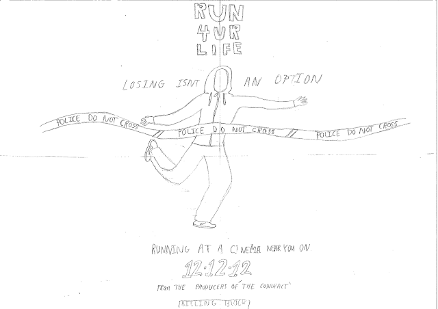
This is our draft poster. Similar to 'I AM LEGEND' it centers our protagonist and our film name (which is in a bold easily read font). We chose to isolate our protagonist in the poster to show how youth feel today ;abandoned and alone. We also used to the tape to create a sinister atmosphere although this is in fact a finishing line for our runner and portrays breaking through the stereotypes or barriers he is faced with (reinforced by his race finishing posture). At the top colloquial language such as 'U' and '4' is used to engage with the audience and more importantly to empathise with them ; through second person address.It is also a form of imperative , somewhat harsh which we hope will be more absorbed by young people because a majority have grown in aggressive environments and this is more easily understood. The title not only reflects our film's content but also appeals to youth to grab the opportunities in life and to not give up.

One thing we forgot to include in this poster was color which would have more clearly made visible the police tape and sirens which should be reflecting from his face.

In addition, the poster keeps the twist of the film hidden to the audience as it doesn't portray anything about Olympic runners. The protagonist is symmetrically centred so the audience can familiarise with who he is. In the poster the character is also postured as if he has finished a race but instead of having to cross the ribbon and flashing camera lights which await most runners he is faced with a  police 'do not cross' tape and a blue light reflected from police sirens is on his face.We used the police do not cross tape in order to symbolise the stereotypes our character is breaking through and the race (struggle) youth have to face today in order to fulfill their dreams.

We have also used many conventions of a film poster such as the billing block and release date included in the bottom of the poster. As the slogan emphasises what happens in the short film, placing the slogan at the middle of the poster gives the audience an idea of what will happen during the film.

This is the final draft of our film poster, as we had others that we thought didn't meet the conventions of a film poster. We didn't include the releasing date and we had the slogan at the top which was defiantly not a convention of a film poster. Hence, when we changed all of this and met the criteria of the conventions of a film poster, we thought we have done a great job and hence we uploaded our final one with all the main conventions of a short film.

Sunday 25 September 2011

Research & Planning Diary (11th Oct - 1st Nov)

During this period of Research & Planning:
  • We came up with ideas of fonts we will use - this had to be suitable for the genre and for the production logo
  • We made a questionnaire of a tag line, asking the audience which tag line will suit most
  • We went to a location scout at South Kilburn - taking many photos and adding them to our blog
  • We also went to Rowley Way, a second location scout, where we took many photos of the location as the location was very large and many good places to film in
  • We made a draft poster however was not coloured in - but you can see the poster clearly - many said this poster was very good and suitable for our short film
  • We organised the shots and location

Saturday 24 September 2011

Organising the shots and locations

Now that we have visited the location, we gathered information by creating a questionnaire for all media student at Paddington Academy sixth form, asking them which shots would be most suitable for out short film, and which order shall we put it in. By doing this, it gave us a rough idea of what we are going to film, where we should film it and why we should do so:

1. Our first location will be in the protagonists house which will show the protagonist waking up. One of the group members friend lives in the location we will be filming, hence it will be better filming inside the house as we can have shots of the protagonist leaving his house and shots walking down the stairs in this chosen picture above.

2. We planned to use the car park for the second opening shot. We thought we can have a shot of the person leaving the estate through this path, and even start jogging. in addition, we figured of having the "deal" of the delivery guy and the protagonist shot here as it seems as in the eyes of the audience, it will seem as a drug deal.


3. As the protagonist leaves the park underground, as well as us, the nominees in the questionnaire also though of having the protagonist have the main scene where the protagonist runs in this path. We thought this as we can have the victims looking out of their window which links to other shots.


4. The questionnaire results showed that the above shots can be inserted with any location as it can be linked with anything.

Now having the shots and location fully planned, we hopefully will go to the location and start filming. unlike last year, we don't need no permission from any one. however last year we need permission from things such as the hotel manager ans the public transport.

Choosing the location for short film

Having thought of our plot and ideas, we had to think of a location which will suit most. a silent, gritty urban area with many buildings around it. From a variety of locations, we had to choose one which suited our genre and however close to the school in case any emergency's and to make the journey easier and shorter. We had opportunities from the following:
  1. Brixton (South London)
  2. Earls field (South East London)
  3. South Kilburn (North West London)
  4. Tottenham (North London)
  5. Mozart (West London)
  6. Rowley Way (North West London)
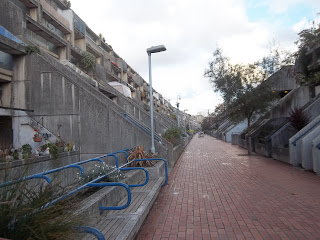
Our group had to consider which location will suit the most, and which location will be better considering the journey time. We can to a decision to choose Rowley Way (North West London) for many reasons. Firstly, the estate is very quite hence no interferences with anything/anyone. Secondly, the journey time will take approximately 20-40 minutes, which give us time to go there and back various times in one day. Finally, the estate suits our genre as this area is full of attached blocks with many entrances and exits.

Our second option was South Kilburn (North West London). We never chose this location mainly because of local conflicts between the two areas south Kilburn and Mozart. on the other hand, the building in south kilburn will suit a lot more than the ones in Rowley way. The building were very big and tall, suiting the chosen genre in our short film.

The Following pictures are pictures taken in Rowley way:


These photos were taken from the Internet, however our group has decided to take a trip up to Rowley way as soon as possible to actually see the location ourselves as we thought we needed a first time experience to consider whether Rowley way is our main option.

Location Of Filming

This is a birds-eye-view picture of the exact location we were filming in and the picture was imported from google maps. Our group chose to import it as it would be very useful for both the gorup and the teacher of the location we would be filming in, in case of any emergencies and simply show our group where would be filming. the exact location in the picture is the mark 'A' and this is where most of the short film will be filmed.

Location Scouting - Rowley Way & South Kilburn

Our first location scout was in South Kilburn. this is a very good location as it is near to the school, and has many blocks and alley ways we could film in. the only problem was the conflict between the two areas around our school and we might be caught in cross fire. Here are some photos of the main area in South Kilburn we wanted to film in:


We thought this would have been one of our top options we would film in. However we still haven't went Rowley way so we couldn't choose South Kilburn as our option. During these few days, our group will hopefully take a second scouting trip towards Rowley way and take some walking shots and judge which is better and which location will be chosen for our final short film.

Having considered to have Rowley way as our option to film, we also thought of taking a trip up there to see a first time experience. We took a Digital Camera with us to take photos of the main locations and the Rowley way estate. On the way to Rowley way, we had to pass south Kilburn so we thought we might as well go there to also take a first time experience. Here are the photos we took:


We knew the area that initially got the the images online, in the second location scout we wanted to visit the location to get original images and walk through some of our shots first hand. Having visited the area, our group was even more impressed as there shots that were not seen on the Internet. for example, the car park was not visualised on the Internet, however visiting the location, we saw the car park and that was one of many important shots for our short film.